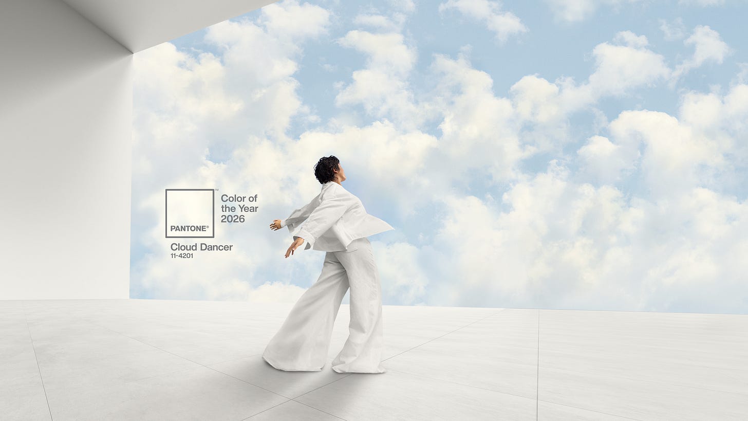
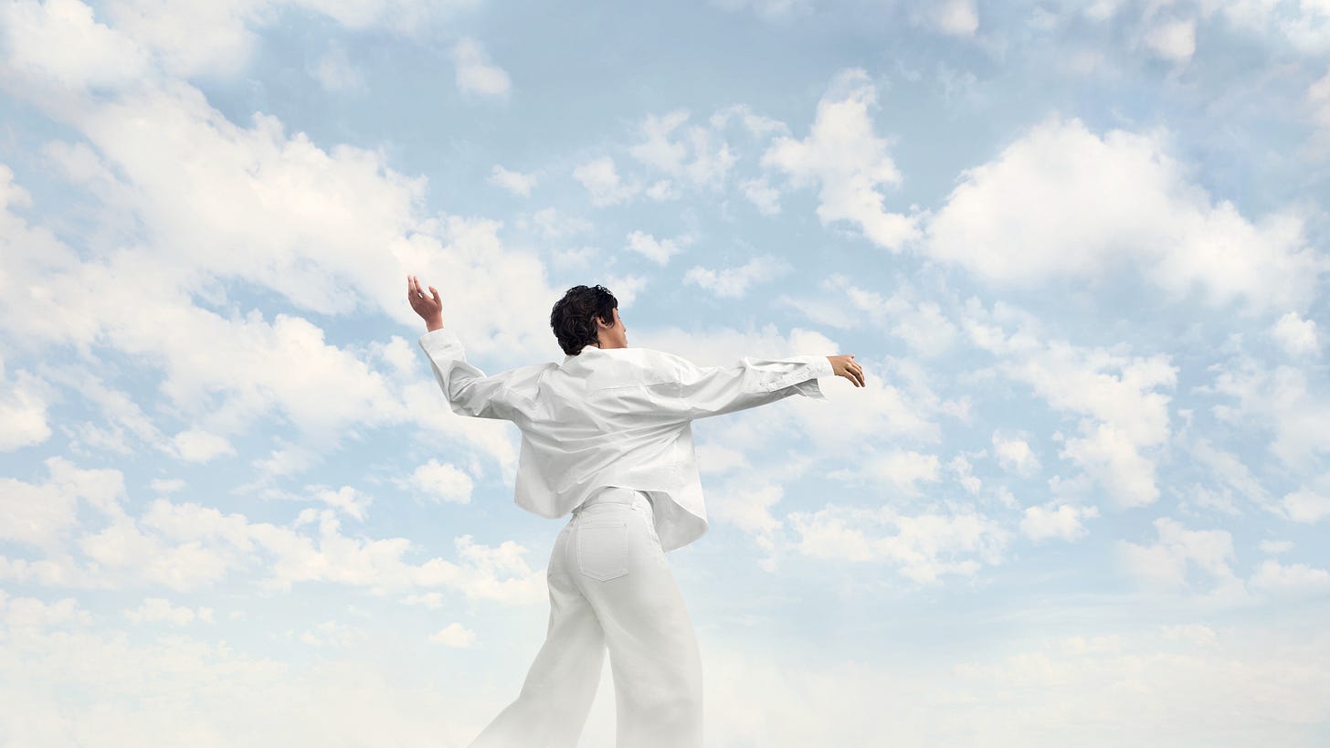
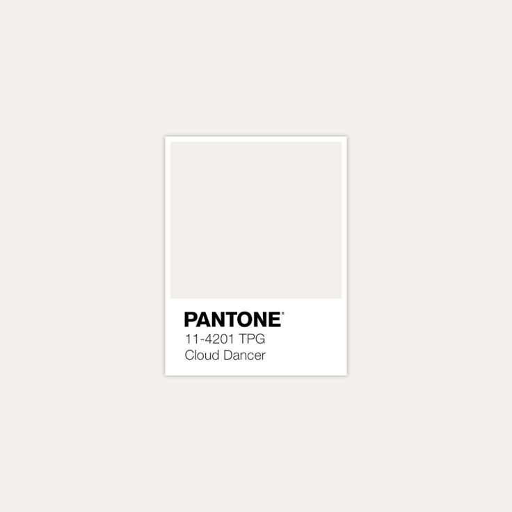
Happy Tuesday everyone! Probably comes as no surprise that this week I’m talking about Pantone’s 2026 Color of the Year “Cloud Dancer” (PANTONE 11-4201), the billowy off-white you see below. Let’s get into it!
“A whisper of tranquility in a noisy world.”
Psychology
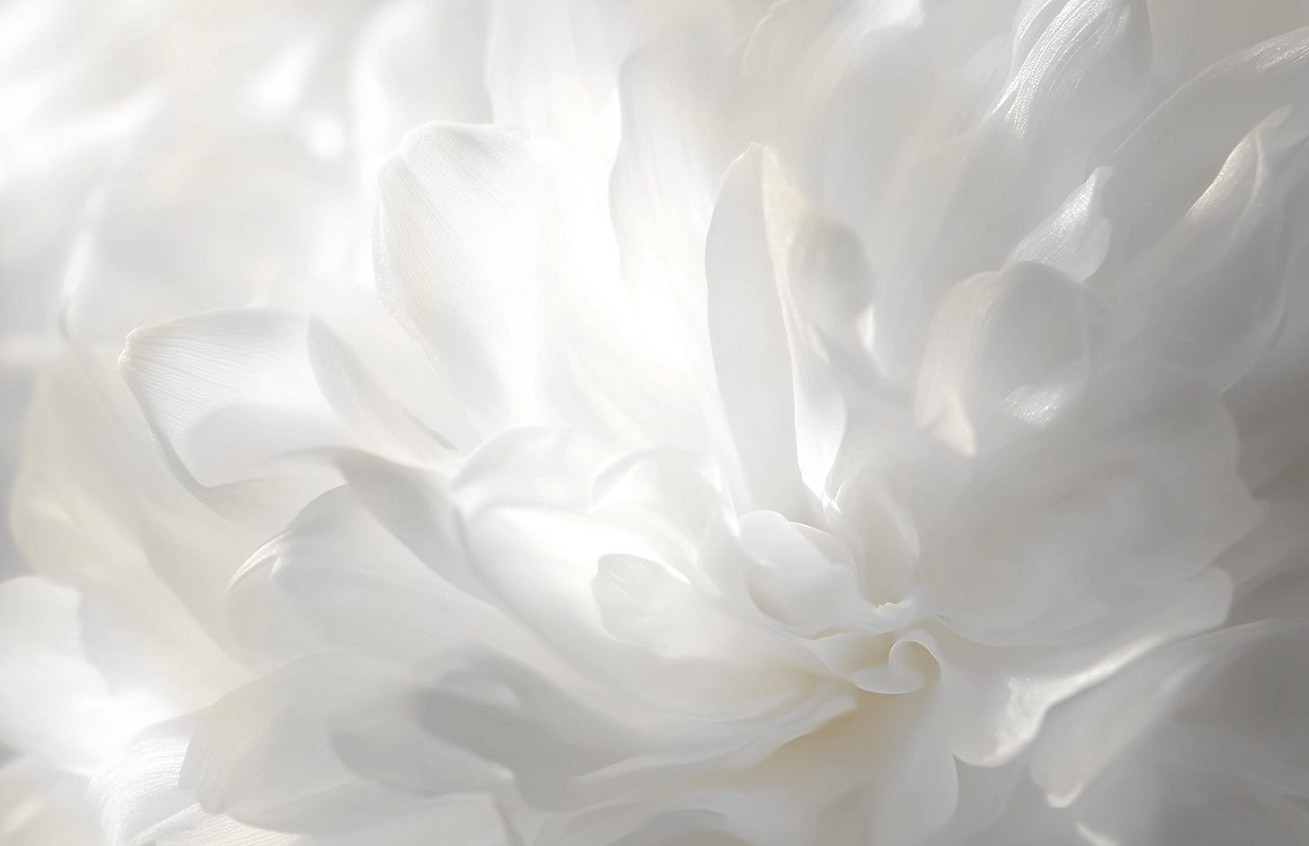
Psychologically, this soft off-white serves clarity, simplicity, reset energy, calm and contemplation. It’s not loud or stark but rather breathable and quietly optimistic, encouraging slowing down and groundedness.
About Our 2026 Color
Pantone describes Cloud Dancer as a response to a cultural moment defined by overload. In an age of digital saturation, constant stimulation, and accelerating change, Cloud Dancer is meant to represent a reset.
Pantone describes Cloud Dancer as a response to a cultural moment defined by overload. In an age of digital saturation, constant stimulation, and accelerating change, Cloud Dancer is meant to represent a reset.
“Similar to a blank canvas, Cloud Dancer signifies our desire for a fresh start… allowing new insights and bold ideas to emerge.”
— Laurie Pressman, Pantone Color Institute
Cloud Dancer is Pantone’s reminder that silence has shape, and that clarity has color, that sometimes the most radical thing is to peel away old assumptions so something new can take form.
“A conscious statement of simplification… enhancing our focus and helping us hear our inner voices again.”
— Leatrice Eiseman, Pantone Color Institute
Expansive yet discreet, it creates atmospheres of serenity and visual cleanliness. As a structural neutral, it supports every color around it, offering balance, harmony, and quiet contrast whether used alone or in palette.
#Controversial!
Pantone’s 2026 color choice also stirred up some debate as many expected a bolder color, something tied to AI, digital culture, or global tension.
Some critics call it “not even a color” and “too safe for a world in flux,” while some designers defend the choice, arguing that the quiet shade rejects of overstimulation and a palette cleanse in a hyper-saturated era.
Others state that elevating a white-leaning shade as “Color of the Year” carries uncomfortable cultural implications, even calling it “whitewashing” and “Pantonedeaf.”
In recent days, the choice of white has been questioned online, given the current political discourse, and the rollback of DEI programs. It has also been suggested that white signals wealth and elitism, as in you can afford to keep your clothes clean.
— WWD (Pantone Responds to ‘Color of the Year’ Controversy)
Controversy aside, this shade has been and continues to be prominent across all types of design…speaking of which, let’s check out some fashion and interior design applications!
Fashion
Ralph Lauren Purple Label Men’s Spring 2026 Ready-To-Wear Collection
In Ralph Lauren’s Spring 2026 collection, a soft and architectural Cloud Dancer type-shade elevates linen, knit textures, and tailored silhouettes into something effortlessly refined.
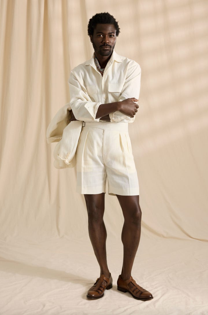
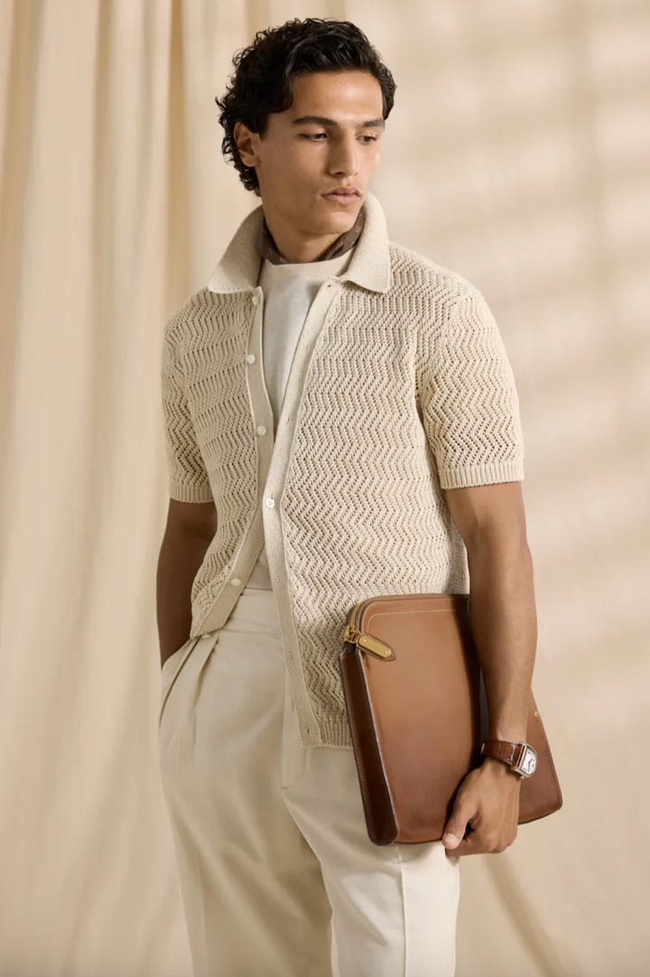
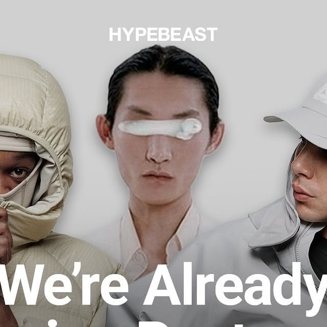
Check out this post by @Hypebeast on IG to see a somewhat extensive list of fashion brands featuring similar off-white shades this upcoming year:
Interior Design
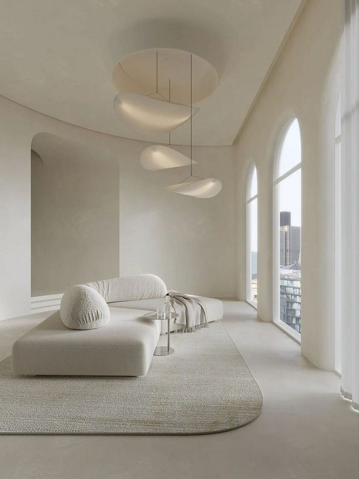
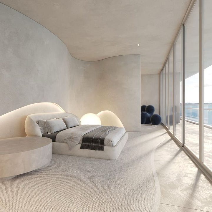
Common, but for a reason as it’s hard to go wrong with a neutral like this in interior design. It not only reflects light, but acts as a gentle backdrop that expands a room and lets other materials and textures stand out.
In the two monochromatic interiors below, for example, the off-white envelops the room in a way that feels sculptural and tranquil.
Color Specs
If you’re interested in working with Pantone’s Color of the Year, I’ve included all of the specs below:
HEX: #F0EEE9
RGB: 240, 238, 233
CMYK: 2, 2, 5, 0
L*a*b*: L 93.84, a 1.03, b 4.27
As always, thank you so much for reading! If you enjoyed reading, please give this post a like so I know what you guys want to see more of :)
And tell me, which color should I feature next? See you next Tuesday!


