


Facebook® Blue
History, User Interface Design, Branding, Pantone® & More

Back at it with another blue—did you know that Facebook’s famous brand color was originally chosen by Mark Zuckerberg because of his red-green color blindness?
This crisp, bold blue has become synonymous with one of the most influential digital platforms of the 21st century—a deliberate brand asset symbolizing trust, clarity, and connectivity.
A Brief History
When Mark Zuckerberg was building Facebook in its early days, he needed a color that worked both visually and personally. As someone with red-green color blindness, blue was the most vivid color he could see clearly.
“Blue is the richest color for me. I can see all of blue.” – Mark Zuckerberg, New Yorker, 2010
So, in the case of Facebook, blue wasn’t just a brand choice—it was a practical one that over time, evolved into a strong anchor of digital familiarity.
A Bit of a Rebrand
Back in the early dot-com days, Facebook Blue’s original shade was #4B68AB. Here’s what the old Facebook logo looked like, for those who may not remember:
Then in 2019, Facebook’s parent company rebranded as Meta, complete with a new logo, font, and gradient-heavy design system.
While Meta moved toward deeper blues and purples, Facebook chose to stay true to its blue—refreshing it from the original, slightly darker muted tone you just saw to the brighter #1877F2 shown below:

This slight change helped create a stronger visual boundary between Facebook (the product) and Meta (the parent company), preserving legacy recognition while signaling innovation at the top level!
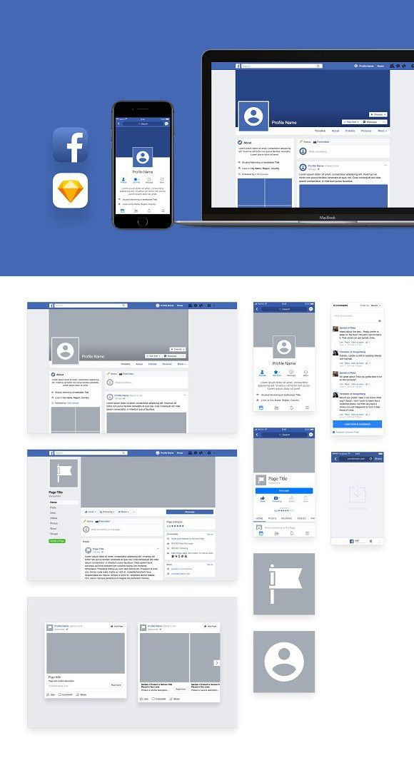
User Interface Design (UI/UX)
In the Facebook app, this blue shows up across:
The logo and app icon
Menu headers and navigation bars
Buttons like “Like”, “Post” and “Send”
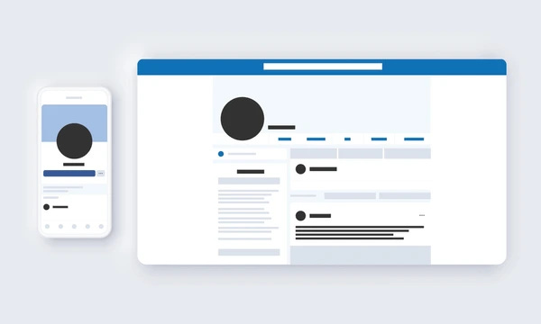
The use of color is not just decorative—it strategically drives interaction and action, standing out against a light, airy interface and ensuring continuity across mobile and desktop.
Though I’m not a regular Facebook user, it’s safe to say the user interface is doing its job—it’s clean, intuitive, and easy to navigate. Not to mention, Facebook has over 3 billion registered users and over 2 billion logging in daily.
Brand Design
Facebook Blue is digital-first by design, meaning it’s used consistently across web, mobile, and marketing materials.
Whether you’re logging in, watching Reels, or joining a group, you’re seeing this signature color doing heavy lifting behind the scenes.

And as the tech landscape shifts, the color remains one of the most enduring elements of the brand—representing connection, community, and simplicity.
Pantone® & More
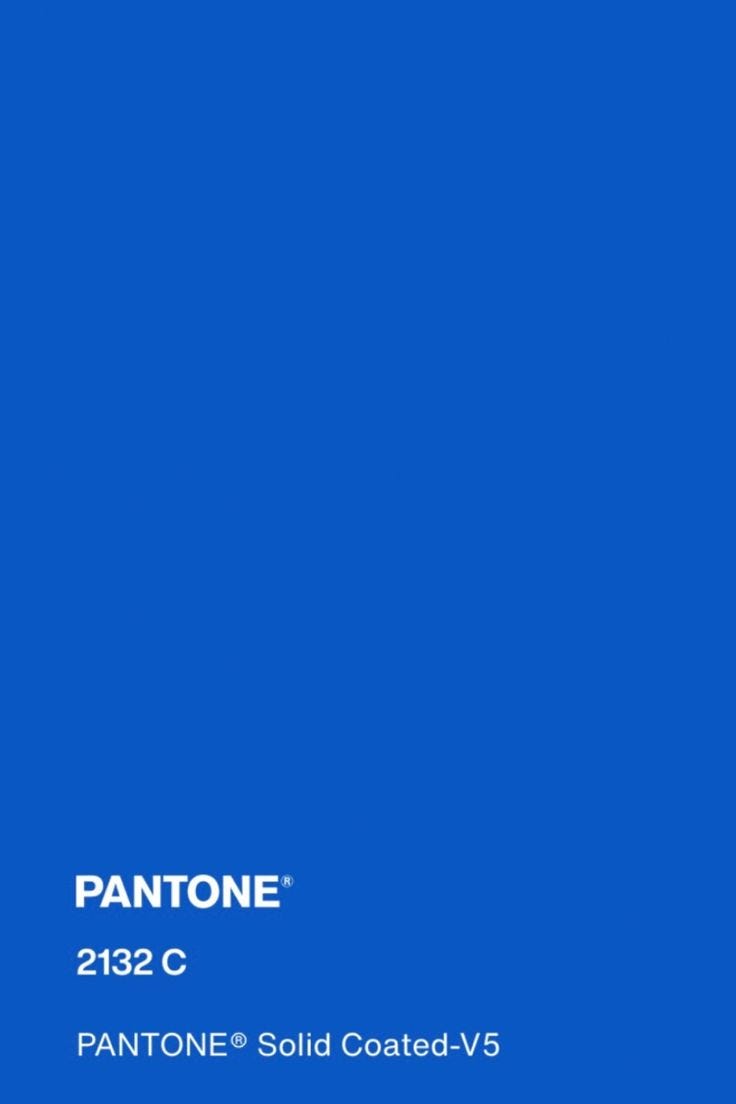
Facebook Blue doesn’t have a publicly confirmed Pantone match, but a similar match I found is PANTONE 2132 C.
Hex Code: #1877F2
RGB: 24, 119, 242
CMYK: 90, 51, 0, 5
Some designers also reference Pantone 2728 C or Pantone 285 C as other close approximations.
As always, thank you so much for reading—your support is greatly appreciated. If you enjoyed learning about Facebook Blue, please give this post a like so I know what you guys want to see more of:)