

Matisse Green
Art History, Fashion + Interior Design, Branding, Pantone® & More

Happy Tuesday! Today I’m back with another artist-inspired color! It’s been a while since I’ve done one of those. This week’s color is Matisse Green, an organic shade inspired by Henri Matisse’s colorful paintings.
Psychology
Psychologically, this earthy, slightly muted shade of green communicates growth, creative vitality, and renewal. With a maturity that isn’t flashy, it’s both grounding and inspiring.
Art History
As I mentioned earlier, today’s color is inspired by Henri Matisse (1869-1954), the Fauvist painter who is also considered to be one of modern art’s greatest colorists.
In the early 1900s, Matisse led a group of painters who became known as the Fauves, or “wild beasts.” Fauves was originally meant as an insult from a critic at the 1905 Salon d’Automne over their use of unnatural, saturated colors.
Fauvism is, in essence, dramatically painting emotion through color despite straying from reality in doing so. Faces can be green, shadows red, and landscapes purple.
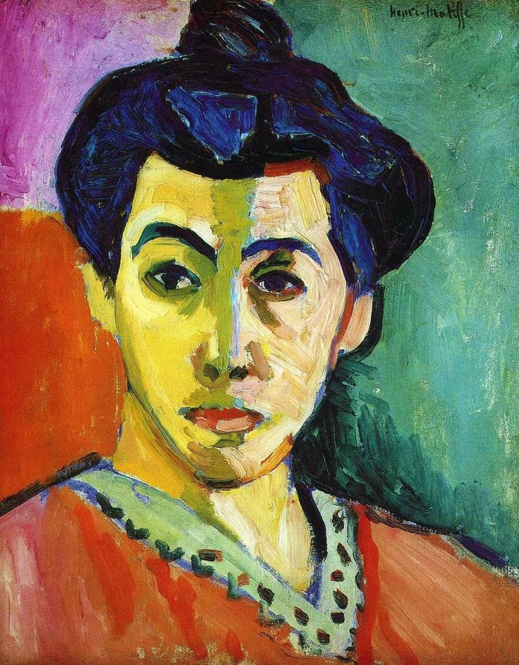
Considered one of the defining masterpieces of Fauvism, the Portrait of Madame Matisse (The Green Stripe) which you see above is often used in textbooks and museum intros to explain the movement.
The vertical band of green down his wife Amélie’s face scandalized Parisian audiences, but it also gave birth to modern color as we know it.
Here are some more colorful artworks of Matisse’s featuring the green shade:


I should also mention that he worked with lots of different greens, so the specific shade I’ve chosen for the purpose of this article is the one that felt the most true (and common) across his work.
Color in Matisse’s free-spirited works doesn’t just decorate, it provokes. Now let’s take a look at some modern design applications of the shade!
Fashion
Hermès Fall 2025 RTW
In the Hermès Fall 2025 collection, a tailored coat, straight-leg trousers, and a V-neck dress all appeared in varieties of the green shade, giving the lineup a sleek but grounded feel.


Only four looks in the entire collection (two of which you just saw) break from the sea of mostly black, beige and dark neutrals, all serving a green pop.
Stine Goya Copenhagen Fall 2025
Stine Goya’s fall collection featured watercolor-esque pink and green florals on a dark shirt and pant set with matching bag, and on a long T-shirt dress with gloves. Found these two painterly pieces to be rather fitting for today!


Interior Design
In interior design, the green shade works beautifully across mid-century, and eclectic bohemian styles where earthy tones bring both depth and livability.
Here, you can see the color in a dining room paired with coral accents for a more artistic and eclectic mood, while in the second space it extends across walls, trim, and ceiling to create a calmer, more traditional feel.


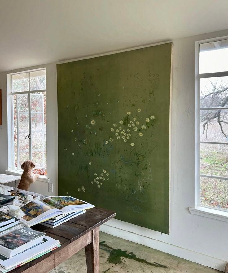
As an accent color, green succeeds at bringing depth and contrast without dominating a room. Even a single statement piece, like the painting below, for example, can shift the mood of an otherwise neutral space.
Branding
Not too common in mainstream branding, but this shade works well for artisanal packaging, eco-conscious identities, and creative industries that aim to convey sophistication and groundedness with a natural edge.
Mika Matcha
You can see that effect in Mika Matcha’s branding, for example, where a similar green shade paired with pink feels fresh, artistic, and memorable.


Pantone® & More
If you’re interested in working with Matisse green, a close Pantone match I found was “Moss Green” 7491 C. I included the HEX, RGB, and CMYK values of the specific shade I picked below as well.
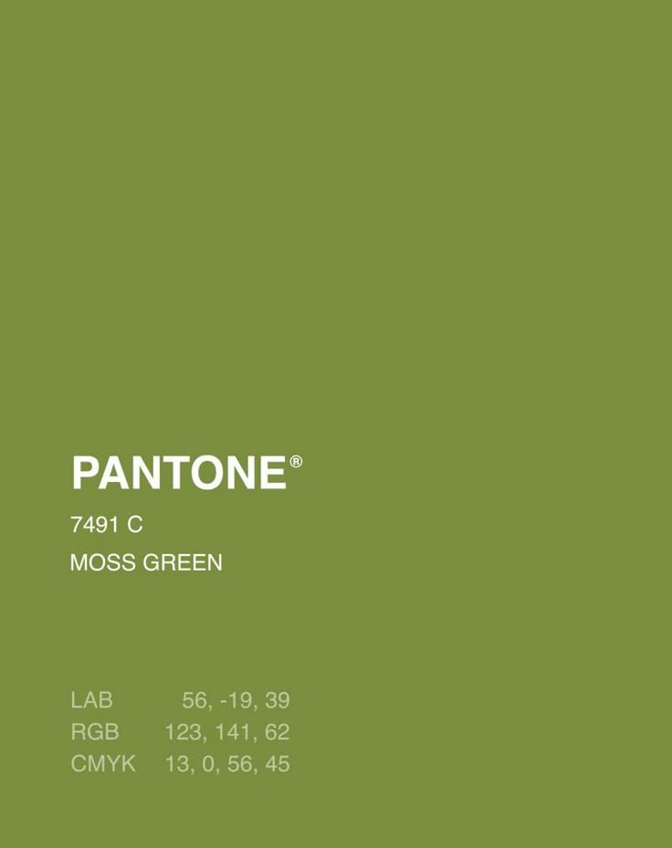
HEX: #789547
RGB: (120, 149, 71)
CMYK: 19, 0, 52, 42
Once again, thank you so much for reading, and hopefully you learned something new about today’s green shade! If you enjoyed reading, please give this post a like so I know what you guys want to see more of :)
And tell me, which color should I feature next? See you next Tuesday!