Mocha Mousse
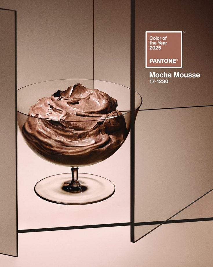
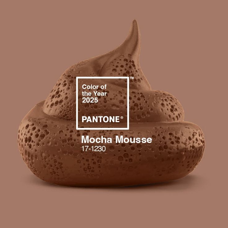
It’s that time of year again—Pantone’s Color Oscars. And the winner of 2025 is PANTONE 17-1230 Mocha Mousse—a warm, rich brown that’s equal parts comfort and indulgence.
Before we get into it, I’m curious to see how we’re feeling about this brown being chosen as our color of the year!
I personally think it’s a great choice—easy on the eyes and definitely carries an aura of sophistication and luxury.
Why it Was Chosen
Pantone’s pick for 2025 taps into a growing need to slow down, reconnect with nature, and find a little peace in the chaos.
Mocha Mousse is said to have been inspired by the things that ground us—natural tones like cacao, earthy pigments, and simple everyday moments like coffee breaks.
Slowing Down Trend Cycles
Secondly, Pantone talked about the growing demand for seasonless, timeless colors as trend cycles slow down. Mocha Mousse is a response to that, offering a shade that can work year-round across fashion, interiors, and design.
Fast fashion and short-lived design trends have undoubtedly led to growing backlash, so consumers are now looking for colors and styles that can stand the test of time. Makes sense!
This is how Leatrice Eiseman, Pantone’s Executive Director, describes the color:
“Sophisticated and lush, yet at the same time an unpretentious classic… It envelopes us with its sensorial warmth.”
Mocha Mousse in Design
Interior Design
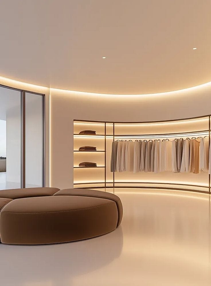
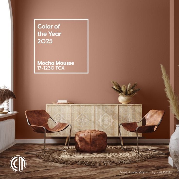
Mocha Mousse is great for creating spaces that feel warm, calming, and cozy. It pairs beautifully with a variety of different colors, but especially soft whites, muted greens, and charcoal grays for a modern, earthy look.
Picture plush brown velvet chairs, natural wood accents, or walls painted in this soft color (like in the image below).
Fashion Design
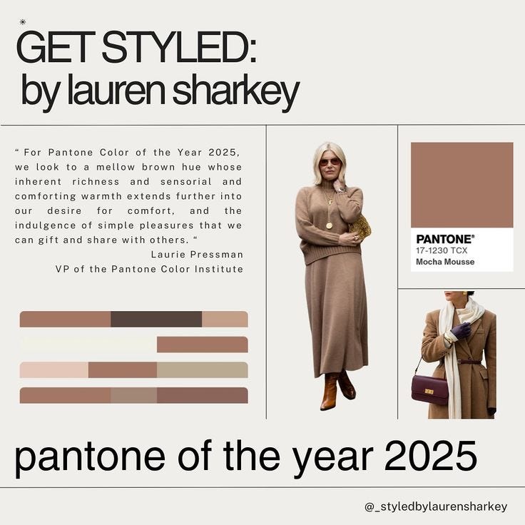
When it comes to fashion, this color is about as versatile as it gets. Mocha Mousse works as a grounding neutral or a statement shade, making it perfect for everything from oversized coats to soft knits and simple basic pieces.
It’s practical, yet timeless. Check out this cute image I found by Lauren Sharkey on Mocha Mousse below!
Branding
Brands looking to embrace natural and sustainable aesthetics will love this shade. Mocha Mousse has a grounded, approachable quality that still feels luxe—ideal for packaging, logos, and web design that want to stand out in a subtle way.
Mocha Mousse Color Palette
Last but not least, let’s talk about the main color palette Pantone provided us with to go along with Mocha Mousse!
Below you can see a nice neutral palette, featuring various warm creams, beiges, tans, and browns.
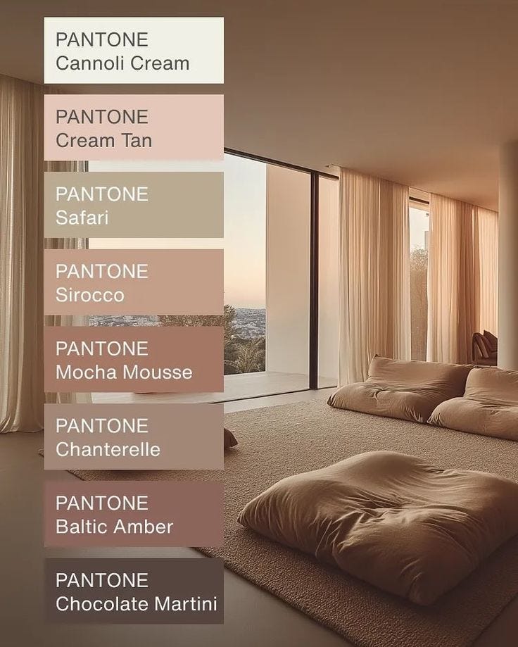
The lighter shades like Cannoli Cream and Cream Tan bring softness and brightness, while deeper tones like Baltic Amber and Chocolate Martini add a sense of depth and richness. Together, these earthy colors create a calming, grounded feel.
I hope you enjoyed this deep dive into Pantone’s Color of the Year!
As always, thank you for reading and for being part of this space! If you have a color you’d love to see featured next, drop a comment or let me know—I’d love to hear your thoughts.


I’m into it. An inspired choice.