Happy Tuesday! Once again continuing with my seasonal color theme, the berry-inspired magenta you see below carries both the warmth and saturation that give it a distinct summer presence.
Psychology
Sitting squarely between red and purple, Magenta blends the passion and energy of red with the creativity and introspection of purple.
It also stimulates enthusiasm without becoming aggressive, and is associated with self-expression and artistic confidence.
Brief History
“Mulberry” draws from the deep, reddish-purple fruit of the Morus tree, cultivated for thousands of years across Asia, the Mediterranean, as well as the Middle East.
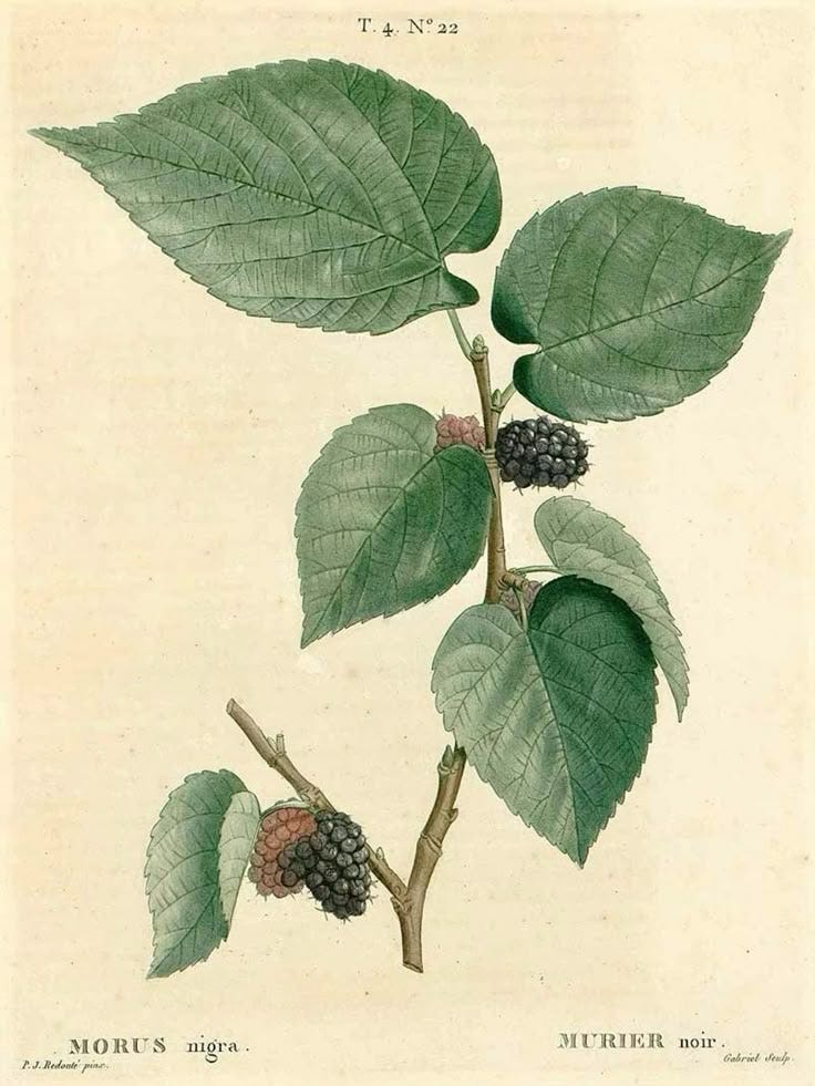
Beyond its culinary use, the mulberry tree has a notable role in textile history. Its leaves are the sole food source for the silkworm, making it integral to China’s silk production as early as 2700 BCE.
The name “magenta” itself comes from a synthetic dye called fuchsine discovered in 1856 by French chemist François-Emmanuel Verguin, that was then renamed magenta in 1859 after the Battle of Magenta in northern Italy.
The dye quickly became a symbol of modernity in fashion, prized for its intensity and resistance to fading — qualities that still make magenta stand out and remain popular in design today.
Fashion
In fashion, our red-purple color of the week does a great job serving as a statement color, and is a versatile choice for everything from bold monochrome looks to vibrant accents via accessories.
Dsquared2 Spring 2026 Ready-to-Wear
In this maximalist Dsquared2’s Spring 2026 ready-to-wear collection piece, our magenta takes center stage in sculptural, floral trousers. Its saturated warmth is further amplified by a bold clash with vivid violet and burnt orange.
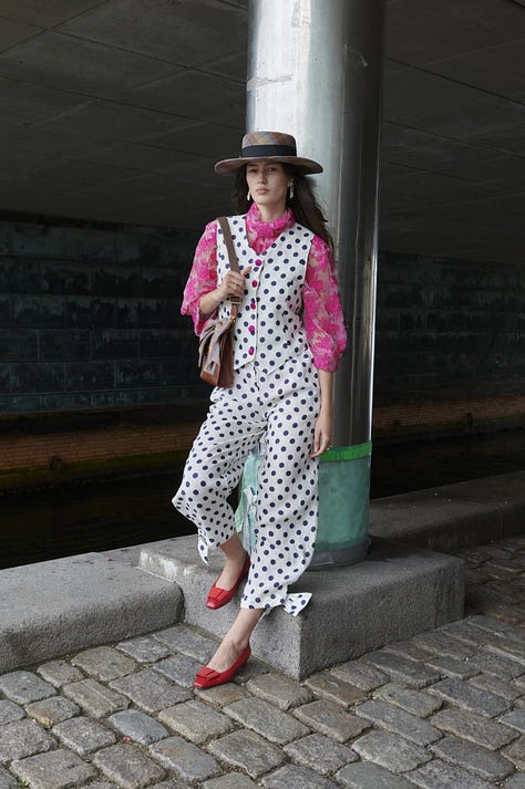
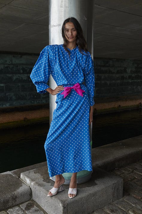
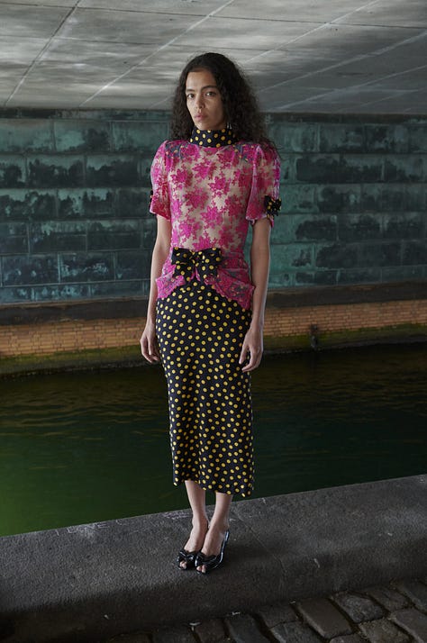
Caro Editions Copenhagen Spring 2026
In Caro Editions’ Copenhagen Spring 2026 collection, on the other hand, magenta appears as a vivid accent against playful polka dots and layered florals, adding warmth to the cool blues and monochromes.
Interior Design
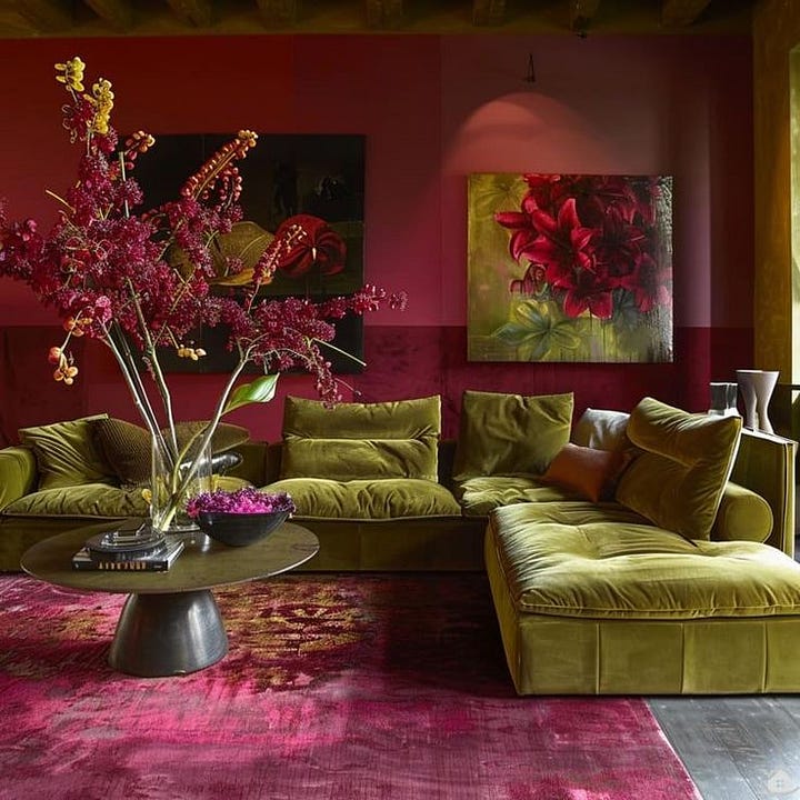
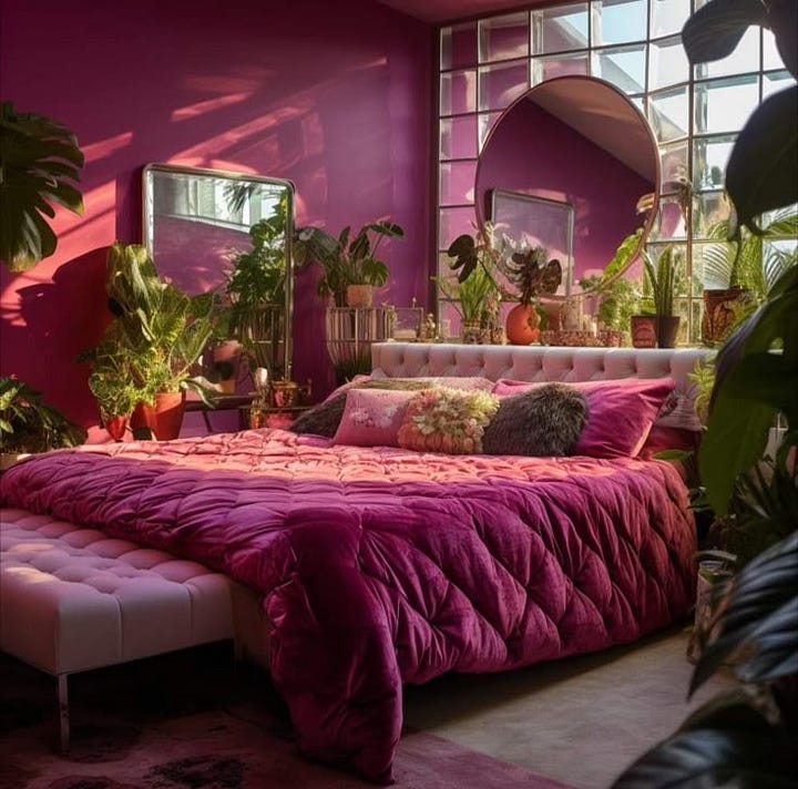
In interior design, magenta definitely brings a sense of drama and vibrancy, creating dynamic spaces that feel both stimulating and full of character.
Here, our magenta anchors the rooms as the dominant color, its saturation heightened by contrasting green upholstery in the first space and lush greenery in the next, creating a vivid yet grounded atmosphere.
And below, our magenta appears in a more muted, textured finish as an accent wall. If you’re worried about the color overwhelming your space, incorporating it as an accent is the way to go.
Branding
Kate Spade New York
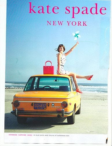
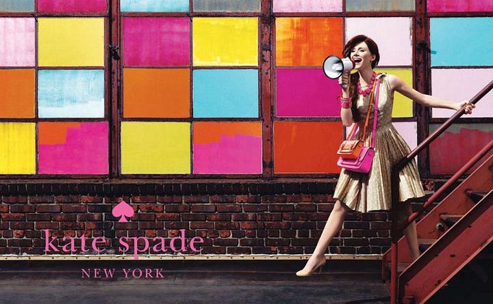
In addition to featuring magenta in their logo and wordmark, the brand often incorporates the color into seasonal handbags and accessories, a vibrant pop of color against their predominantly neutral and pastel collections.
Cosmopolitan Magazine
Another example I found is Cosmopolitan Magazine, with their masthead often appearing in a vibrant magenta (more saturated than our shade, but close enough), especially on print covers with lighter or neutral backdrops.
I also found this Cosmopolitan cocktail graphic using our saturated magenta for its title text and retro rotary phone, tying the drink’s name to a bold and playful visual identity.
Pantone® & More
If you’re interested in working with Mulberry Magenta, a close Pantone match I found is “Very Berry”, PANTONE 18-2336 TCX. I’ve included the HEX, RGB and CMYK values as well below.
HEX: #c54b8c
RGB: 197, 75, 140
CMYK: 0, 62, 29, 23
As always, thank you so much for reading, and hopefully you learned something new today about this week’s magenta. If you enjoyed reading, please give this post a like so I know what you guys want to see more of:)
Or tell me, which color should I feature next? See you next week!


