Athleisure Blue
Fall 2025 Trend Analysis, Psychology, Color Trends Hot Take, Pantone®
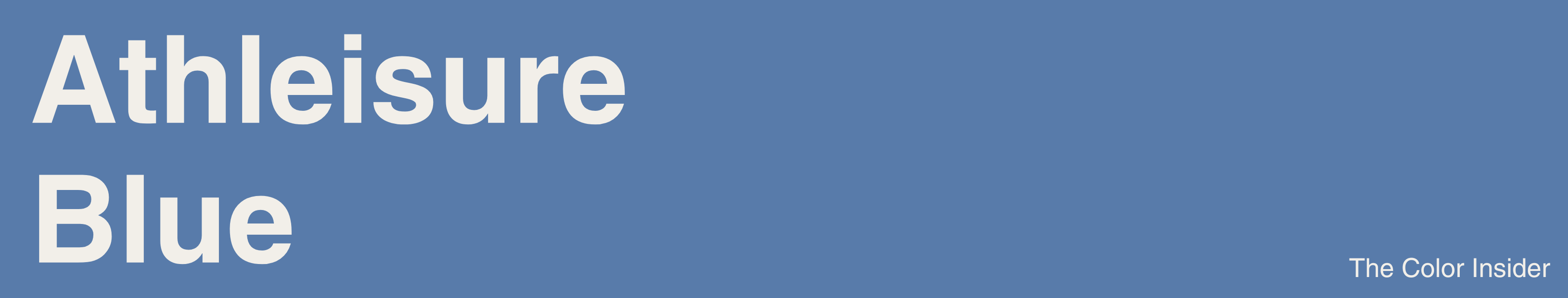
Last week I was shopping at Aritzia when I noticed the athleisure section was filled with grey-blue. Then I realized the big 3 (Aritzia, Alo, Lululemon) are all orbiting similar blues this fall, albeit with their own unique shades and names.
Quick Survey for Interior Designers
If you’re an interior designer or work in spatial design, I’d love your insight.
I’m currently gathering feedback to better understand some of the key needs and challenges of the interior design community today.
My team at Ametra and I have been building a project and color management app for interior designers for quite some time, and now that it’s launched, we’re looking to learn more from the community that inspired it.
So, if you’re an interior designer and you happen to have a few minutes, I’d be very grateful if you could share your perspective in this survey. Thank you!!!
Color Psychology
Blue is the color of composure, still waters. It’s calm, intelligent, and self-assured, communicating stability and ease. Grayish-blue, specifically, is further emotionally composed and capable.
Fall 2025 Athleisure Trend Analysis
Now let’s take a look at the “big three” athleisure brands (Aritzia, Alo, Lululemon) and how they each uniquely lean into blue this season.
Aritzia
Starting off with Aritzia, their French Blue this season is saturated enough to catch the eye but muted enough to feel calm. I’d say it captures the perfect midpoint between energy and leisure. Polished, but also airy.
Alo
Alo’s Bluestone, on the other hand, is definitely a much quieter and more grounded variety of blue. This slate-toned shade feels very disciplined and understated. Cool neutrality. Focus.
Lululemon
And Lululemon’s Blue Twill is a muted mid-tone that feels steady, adaptable, and silently confident. Sitting somewhere between Aritzia’s French Blue and Alo’s Bluestone, it bridges composure and mindfulness with energy.
All in All…
All of these shades are unique enough to claim individuality, yet similar enough to be in the same family. There’s an undeniable theme of serenity across all, though each brand interprets the mood a bit differently.
This season’s blue isn’t loud, it’s rather restrained. I sense control in the color’s visual language, wanting to appear put-together even in comfort.
My Hot Take on Color Trends
I’m actually not a big fan of color trends when it comes to any type of design. I try to curate my personal style and the colors that fit into it based on what I deem uniquely works for me.
So, the goal of this post isn’t for you to go and spend a despicable amount of money on athleisure because “grey-blue is in”. Unless you’re a big fan of the color and know it suits your aesthetic. In that case, do proceed…
Beyond fashion, the reason I’m talking about this today is because such trends help us understand where consumer mood is heading. So where exactly is it heading?
I believe grayish mid-tone blues signal a broader market shift: consumers are seeking visuals that feel composed, reliable, and real.
So, if you work in any type of design — graphic, fashion, interior, branding — or marketing, these types of insights allow you to better lean into what people are currently feeling or looking for. That’s that…
Pantone® & More
The “Athleisure Blue” shade you saw at the beginning is a kind of middle ground of the three brands I decided upon. If you’re interested in working with it, a close Pantone match I found is “Riverside” 17-4028 TCX.
I’ve also included HEX, RGB, and CMYK info below.
HEX: #587BAA
RGB: (88, 123, 170)
CMYK: (48%, 28%, 0%, 33%)
As always, thank you so much for reading! I hope you learned something new about the currently trending grayish-blue! If you enjoyed reading, please give this post a like so I know what you guys want to see more of :)
Or tell me, which color should I feature next? See you next Tuesday!