


Happy Tuesday everyone! Today I’m talking about Aubergine, a rich, velvety purple that is both decadent and grounded. And very fall.
Psychology
Sitting at the darker end of purple’s spectrum, this shade blends the mystery of violet with the earthiness of brown. Unlike brighter, more playful purples, Aubergine carries sophistication, sensuality, introspection, and quiet luxury.
Brief History
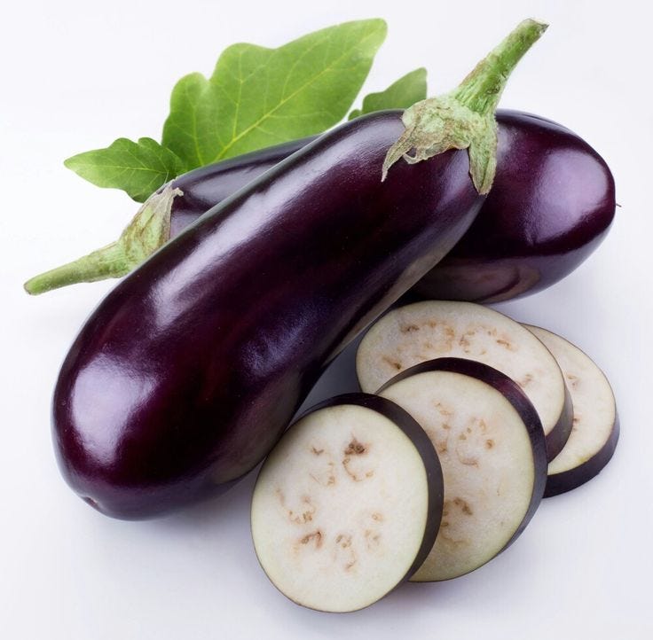
If you didn’t know, aubergine is the French term for eggplant, so our shade has some botanical roots.
Historically, purple dyes were expensive and rare, and therefore often reserved for royalty. Aubergine’s darker tone, however emerged as a more practical, grounded evolution of regal purple.
Then in 18th and 19th century Europe, it became popular in textiles for its ability to appear almost black in candlelight, giving garments a subtle richness without ostentation.
And in the early 20th century, aubergine found its way into fashion and interiors as a modern, eccentric alternative to both black and brown. Now let’s check out some design applications!
Fashion
Chloé Fall 2025 RTW
Chloé’s Fall 2025 Ready-to-Wear collection spotlighted aubergine tones in glossy leather pants and a ruffled satin blouse, accented by layered gold jewelry. Vintage richness with feminine allure.


Caroline Herrera Fall 2025 RTW
Carolina Herrera’s Fall 2025 RTW highlighted aubergine in both cozy knitwear and sculpted satin dresses, showing the shade’s versatility.


Interior Design
I’ll admit this shade isn’t exactly a go-to for me when it comes to interior design, but it undeniably delivers sophistication, moodiness, and drama.
In the images below, for example, aubergine wraps in its velvety depth, giving them a refined, jewel-box atmosphere.


Personally, I prefer Aubergine as an accent color, where smaller details add richness without overwhelming the space. In the example below, that’s achieved through a curtain, carpet, and pillows.

Branding
While less common in mainstream branding, aubergine is prized in niche luxury markets like gourmet food packaging (especially wines and chocolates), as well as beauty and skincare brands.
Chanel Beauty
Chanel, for example, experiments with the shade through their lipsticks and nail polish to signal sophistication, balancing elegance with mystery.


Pantone® & More
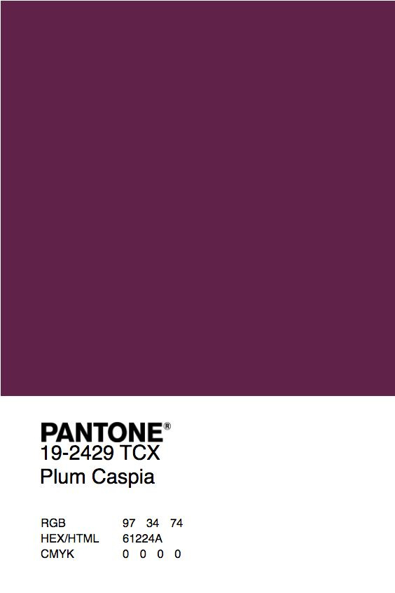
If you’re interested in working with this shade, the closest Pantone match I found was “Plum Caspia” 19-2429 TCX. RGB, HEX, and CMYK details are also included in the image:
As always, thank you so much for reading, and hopefully you learned something new about today’s purple shade! If you enjoyed reading, please give this post a like so I know what you guys want to see more of :)
And tell me, which color should I feature next? See you next Tuesday!