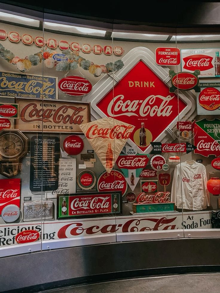
The unmistakable Coca-Cola Red—associated with energy, excitement, and joy—goes beyond mere branding. It’s a cultural symbol that has stood the test of time, weaving itself into the fabric of advertising history and consumer memory!
From classic ad campaigns to contemporary packaging, Coca-Cola Red undoubtedly demonstrates the power of a signature color to create emotional connections and define a brand's essence.
Plus, with the holidays just around the corner, I thought it would be the perfect time to explore the story behind a color that is also closely associated with the wintertime.
A Brief History
Coca-Cola’s iconic red dates back to the late 19th century.
Originally, the color was used on barrels of Coca-Cola syrup, distinguishing them from alcohol containers during transport.
As advertising evolved, Coca-Cola continued to embrace red for its marketing campaigns. By the 1920s, it had essentially become synonymous with the brand.
During the 1940s, Coca-Cola recognized the need for a consistent brand identity as its global presence expanded. To achieve this, the company formalized its use of the vibrant red by working with color specialists to codify the exact shade that is now known as Coca-Cola Red.
The red then continued becoming a cornerstone of packaging and advertising, from the labels on glass bottles to the aluminum cans introduced later.
This brand color effort ensured that no matter where in the world a Coca-Cola product appeared, its iconic red would be instantly recognizable, strengthening its visual identity and emotional resonance with consumers.
Coca-Cola’s Advertising Legacy
As mentioned earlier, Coca-Cola has a history of groundbreaking advertisements, and their use of red plays a starring role.
From the nostalgic Santa Claus campaigns of the 1930s—where Coca-Cola Red became intertwined with the modern depiction of Santa—to the vibrant "Share a Coke" campaign, the color has consistently symbolized connection and celebration.
Red grabs attention, evokes positive emotions, and fosters a sense of belonging. Whether on a billboard or a soda can, Coca-Cola’s brand color aims to communicate joy and togetherness.
Coca-Cola's Architecture
Coca-Cola's influence isn't limited to packaging or ads—it also extends into architectural design. Iconic flagship stores and pop-up experiences utilize Coca-Cola Red as a central design element.
Take the World of Coca-Cola in Atlanta, for instance. The building's sleek, modern design features glass and metallic finishes, complemented by strategic pops of Coca-Cola Red. These accents are incorporated into signage, interactive displays, and even interior seating.
Coca-Cola's retail spaces often use red to evoke energy and excitement while maintaining a clean, approachable atmosphere. It’s essentially a masterclass in using color to reinforce brand identity while creating an inviting experience for visitors.
Color Palette
Inspired by Coca-Cola Red, I’ve created a palette with classic white, dark red, charcoal and gold! It captures the energy and joy that Coca-Cola brand is known for, while adding complementary tones for a cohesive look. Check it out below:
Coca-Cola Red is more than just a color; it’s a cultural icon that has helped the brand build an enduring connection with its audience!
Hopefully, you all enjoyed this deep dive into Coca-Cola Red! Have a color you’d like me to explore for the next Color of the Week? Comment below—I’d love to hear your thoughts!


Hi, I've been trying to track down a hex code or specific reference for Coca Cola Red as you have it depicted here. Is that something you might help me with?